
Drape Backdrop Colour Ideas: Choosing Fabrics That Photograph Beautifully
The colour of a drape backdrop sets the mood of the whole celebration and decides how it looks in photographs. Here is how to choose with confidence.
A drape backdrop is the largest single surface in most event setups. Before a guest notices the florals, the sign or the lighting, they notice its colour. Choosing the right one is less about following a trend and more about understanding the room, the light and the people who will be photographed in front of it.
Start with the venue, not the swatch
A fabric that looks soft and creamy in a showroom can look flat grey in a room with cool white lighting, and a rich colour can look almost black in a windowless hall. Think about where the backdrop will stand and what surrounds it: wall colour, flooring, ceiling lights and how much daylight reaches the spot. The same drape can look quite different in a modern hotel suite, a community hall or a garden marquee.
If you can, visit the room at the time of day the event will happen. If you cannot, send us photographs of the space and we can talk through what is likely to suit it.
Soft neutrals: ivory, champagne and warm taupe
Neutral drapes are the most forgiving choice. They bring height and softness without dictating a palette, which leaves florals, signage and outfits free to stand out. Ivory and champagne feel light and celebratory. Warm taupe and stone sit between light and dark, and they suit a wide range of skin tones and outfit colours in photographs.
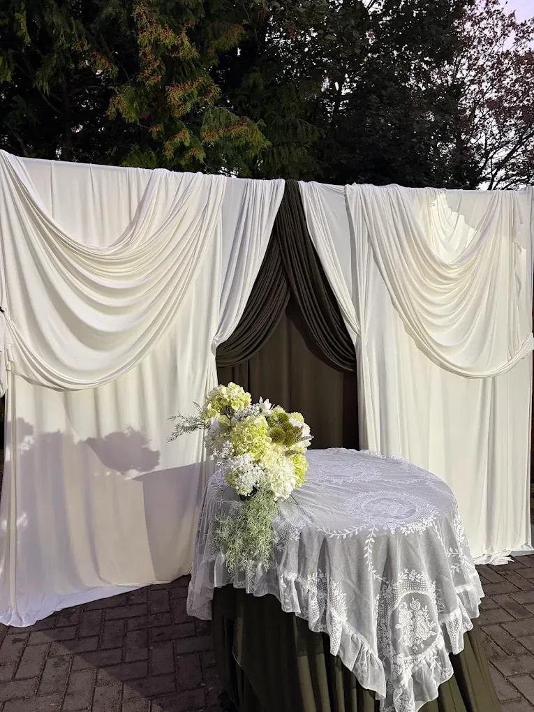
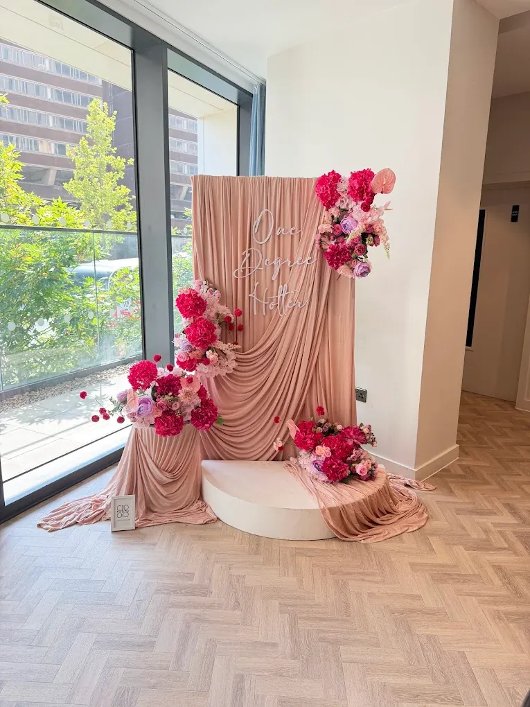
Ivory drapes with an olive layer, and a blush drape styled with deep pink florals
Blush and dusty pink
Blush has become a popular choice for birthdays, bridal showers, engagements and baby celebrations because it feels warm without being loud. It pairs well with creamy whites, deeper rose and magenta florals, and soft metallics. The one thing to watch is the room: against warm orange wood or pink-toned walls, blush can disappear, so we often add a contrasting layer or darker floral accents to give the backdrop definition.
Olive, sage and deeper greens
Olive and muted green drapes are a favourite for a more grown-up, editorial look. They make cream and peach florals glow, and they give a backdrop real depth through the shadows in the folds. They work especially well for milestone birthdays, intimate dinners and celebrations that want a relaxed, natural feel rather than a traditional bright palette. In a darker room they benefit from good lighting, because deep colours absorb light.
Gold, mustard and warm jewel tones
Gold and mustard tones bring warmth and energy. They suit themed celebrations, Mehndis and occasions where you want colour to lead. Because they are such strong shades, they are best supported by simpler surroundings: neutral tables, quieter signage and florals that echo rather than compete.
Think about what sits in front of the backdrop
Outfits, skin tones, balloons, cake tables and florals all end up in front of the drape. A useful test is to imagine the main people in the photograph. A very dark outfit against a very dark backdrop disappears; a pale outfit against ivory can wash out. Contrast, in either direction, keeps people clear in the picture.
Keep the palette to a lead and a supporting colour
Most of the backdrops that look expensive are built from a lead colour and a supporting tone, then one accent in the florals or signage. Layering two shades of the same family, such as a deeper olive over a lighter sage, adds richness without adding clutter. More than three colours across drapery, flowers and signs usually needs a confident hand.
Share your palette early
If you already know your outfit, a colour theme or your venue, tell us when you enquire. We will suggest fabric and floral combinations that suit the room and the occasion. You can explore more on our backdrop and drapery styling page, or browse the setups in our recent work gallery.
Frequently asked questions
Which drape colours work in most venues?
Soft neutrals such as ivory, champagne and warm taupe tend to sit comfortably in most rooms, because they pick up the venue light rather than fighting it. Deeper shades such as olive or chocolate work well when the room has plenty of natural light or white walls to balance them.
Will the drape colour look the same in photographs as it does in person?
Not always. Camera sensors and phone filters can warm or cool a colour, and venue lighting changes it again. It helps to view the fabric in the venue lighting or ask for photographs of similar setups in comparable rooms before you decide.
Can I mix more than one drape colour?
Yes. A main colour with one or two tonal layers usually looks richer than a single flat shade. Keeping the palette to a lead colour and a supporting colour stops the backdrop competing with florals and signage.
Do you match drape colours to an outfit or colour theme?
We design around the palette you share, whether that comes from an outfit, a theme or the venue. Send an image or description with your enquiry and we will suggest combinations that suit the room.
Ready to discuss your event?
Share your date, venue or postcode, occasion and ideas with Liora Events for a tailored discussion.
Start an enquiry